Whether you use PowerPoint or Google Slides, these best practices will help you design your slides for consistency and readability.
Consistency
Layout
A consistent slide layout primarily focuses on the color and size of your font and alignment of content. Using the Slide Master in PowerPoint or the Theme Builder in Google Slides will make your style and design consistent.
Best Practices
- Set Fonts, Sizes, and Colors on the Slide Master (PowerPoint) or Theme Builder (Google Slides). This will make your style and design consistent so that the text is in the same place on every slide. When setting colors, remember that dark text on a white or light background is most accessible.
Image

- Legible Fonts. Choose sans serif fonts (Aptos or Arial instead of Times, e.g.). Keep font size between 20-60pt. Titles are always the largest font on the slide. Avoid large blocks of italic or bold text. Use bold and italics for emphasis only.
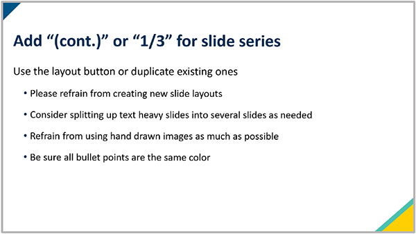
- Slide Titles. Slide titles are required for organization and navigation and should be unique. If a topic continues onto the next slide, repeat the title and indicate a continuation with “(cont.)”. If your topic continues on several slides, replace "(cont.)" with the number of slides, like “(2 of 4)”.
Image
- Turn Off Autofit. Select "Do not Autofit" or change autocorrect settings so that the text doesn't resize.
Content
Implementing best practices for your PowerPoint content helps enhance student engagement and retention by making information more digestible.
Best Practices
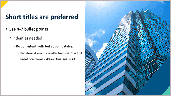
- Chunk by Slide and Topic. Keep content brief and easy to read by using under 30 words and 7 bullets per slide. Less text improves readability and focus.
Image
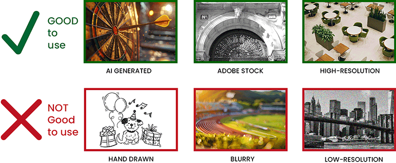
- Add Appropriate Images. Photos, charts, and illustrations enhance text-heavy presentations and clarify topics. Use high-resolution AI-generated images or stock photography from sources like Adobe Stock, Midjourney, or Unsplash. Avoid hand-drawn, blurry, or low-resolution images; find suitable replacements instead.
Image
- Obtain Copyright Permission. Images from textbooks, articles, or the web must be cited and approved. Visit the Copyright for Teaching Library Guide for more information.
- Plan to Reuse Slides. On individual slides, remove semester or date references, and textbook chapter or page numbers. Use an easy-to-update title slide instead.
Accessibility
Using a PowerPoint template helps ensure your presentations are accessible by providing a structured layout that meets accessibility standards. Using the Accessibility Checker in PowerPoint is highly recommended and can identify and guide you in correcting any accessibility issues.
Image
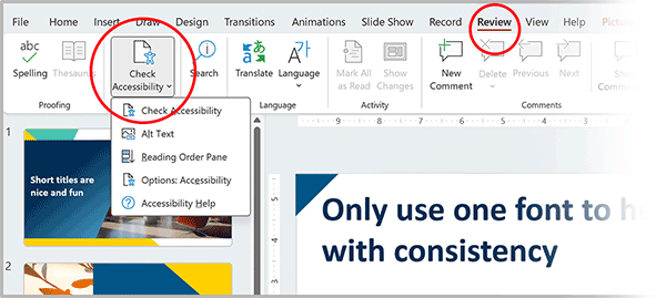
- Run the built-in Microsoft accessibility checker in PowerPoint or the Grackle Slides accessibility checker in Google Slides. Correct all errors so that your presentation will work online and with screen readers.
- Accessible Colors. When setting colors, check color contrast. Dark text on a white or light background is most accessible.
- Accessible Font. Avoid using ALL CAPS, except for acronyms, as screen reader software may read each letter individually. Refrain from underlining text, as it can be mistaken for links in digital content.
- Template Layouts. Use template layouts to maintain correct reading order.
- Accessible Videos. Don't hide video or audio controls. Remove or turn off autoplay. Provide captions.
- Accessible Images. Add alt text to photos, charts, and illustrations that are not decorative.
Resources
Presentations in ODUGlobal Courses
During the course development process with Digital Learning, your instructional designer will provide you with ODUGlobal PowerPoint templates to use when creating presentations. Our staff also can assist and guide the planning, creation, or revision of presentations that will be incorporated into your live or asynchronous course content.
These ODUGlobal PowerPoint templates are also available here (MIDAS login required):